Current Artifact Descendants
All the charts presented in that section support the Artifacts Set feature, which allows to define the set of descendant artifacts to consider in the chart.
To know more about the Artifacts Set syntax, have a look at the Single Version Charts section.
Artifact Pie
This chart is supported in Model/Group Dashboards and Artifact Dashboards.
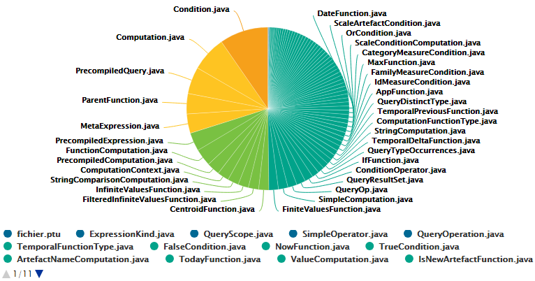
The Artifact Pie offers a graphical representation of the values of a specific measure for each child artifact in a pie chart.
The Artifact Pie requires one measure to define the size of the pie slice and accepts a colorFromIndicator attribute to pick the colors of the pie slices based on a scale.
Clicking a pie slice takes you to the dashboard of the corresponding artifact.
<chart type="ARTEFACTPIE" id="ARTEFACT_PIE_EXAMPLE" colorFromIndicator="ROOT">
	<paths>
		...
	<paths>
	<measure>LC</measure>
</chart>
On top of supported common attributes, this chart also accepts the following additional attributes:
-
artefactsLimit(optional, default: 2000 ) allows limiting the number of child artifacts to include. -
decimals(optional, default: 0) is the number of decimals places to be used for displaying values. -
labels(optional, default: true) displays the labels. -
valueOnLabels(optional, default: false) displays the value alongside the labels. -
colorFromIndicator(optional, default: none) uses the specified indicator’s color scale to assign a color to each item drawn on the chart.
When used in this chart, the measure element accepts the following attributes:
-
dataBounds(optional, default: "];[") defines the range of values allowed to be displayed on the chart. You can use this attribute to exclude drawing an erroneous or non-representative value on a chart.[and]allow you to specify that the boundary value is included, while]and[allow you to specify that the boundary value is excluded.
|
This chart can be used in Model/Group Dashboards.
In this case, the only value allowed for |
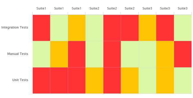
Artifact Scrumboard
This chart is supported in Model/Group Dashboards and Artifact Dashboards.
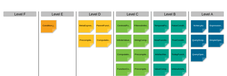
The Artifact Scrumboard offers a graphical representation of child artifacts organised into categories that can be either levels on a scale, or different values for textual information or a measure. Each artifact is represented as a sticky note and is clickable, so you can reach the artifact’s dashboard directly from the scrumboard.
<chart type="ARTEFACTSCRUMBOARD" id="ARTEFACT_SCRUMBOARD_EXAMPLE" postitByColumn="2" displayEmptyData="true" orderByMeasure="SLOC" invertedLevels="true">
	<paths>
		...
	<paths>
	<indicator excludeLevels="UNKNOWN;LEVELG">ROOT</indicator>
</chart>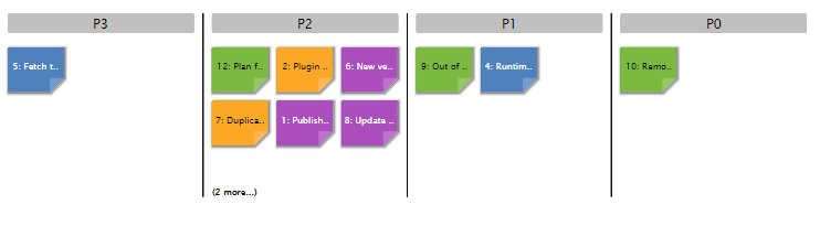
<?xml version="1.0" encoding="UTF-8"?>
<chart id="SCRUMBOARD_ISSUES" type="ArtefactScrumBoard" colorFromIndicator="STATUS" invertedLevels="true">
	<paths>
		...
	<paths>
  <info>PRIORITY</info>
</chart>
The Artifact Scrumboard requires either one indicator, measure or info element to build the scrumboard categories.
On top of supported common attributes, this chart also accepts the following additional attributes:
-
artefactsLimit(optional, default: 2000 ) allows limiting the number of child artifacts to include. -
orderByMeasure(optional, default: none ) allows sorting the sticky notes in each category according to the value of the specified measure. -
inverted(optional, default: false) allows reversing the sort order defined by theorderByMeasureattribute. -
decimals(optional, default: 0) is the number of decimals places to be used for displaying values. -
displayEmptyData(optional, default: false) forces the display of all levels in the scale when set to true, even if there are no artifacts for that level. -
maxPostitWidth(optional, default: dynamic) specifies the maximum width to draw sticky notes. This setting may override the value ofpostitByColumnin some cases. -
invertedLevels(optional, default: false) reverses the order of the scale levels on the board when set to true. -
postitByColumn(optional, default: 3) specifies the minimum number of sticky notes to display per line in each category. -
colorFromIndicator(optional, default: none) uses the specified indicator’s color scale to assign a color to each item drawn on the chart.
When used in this chart, the measure element accepts the following attributes:
-
dataBounds(optional, default: "];[") defines the range of values allowed to be displayed on the chart. You can use this attribute to exclude drawing an erroneous or non-representative value on a chart.[and]allow you to specify that the boundary value is included, while]and[allow you to specify that the boundary value is excluded. -
binningTypeallows to group values in intervals, when displaying a measure’s data. Accepted values are:-
STEP_VALUE for metrics representing numerical values. When defined, the following additional attribute is required:
-
stepValueto define the range of each interval to be created.
-
-
DATE for metrics representing dates. When defined, the following additional attribute is required:
-
stepDateto define the period covered by each data bin. Accepted values are:-
SECOND
-
MINUTE
-
HOUR
-
DAY
-
WEEK
-
MONTH
-
QUARTER
-
YEAR
-
-
-
DURATION for metrics representing durations. When defined, the following additional attribute is required:
-
stepDurationto define the time covered by each data bin. Accepted values are:-
SECONDS
-
MINUTES
-
HOURS
-
DAYS
-
WEEKS
-
DAYS_30
-
DAYS_90
-
DAYS_365
-
-
-
When used in this chart, the indicator element accepts the following attributes:
-
excludeLevels(optional, default: empty) to hide levels and exclude them from chart computations.
When used in this chart, the info element accepts the following attributes:
-
label(optional, default: the information value ) defines or overrides the label used for the information. -
excludeInfos(optional, default: empty) to hide information on the chart and exclude them from chart computations.
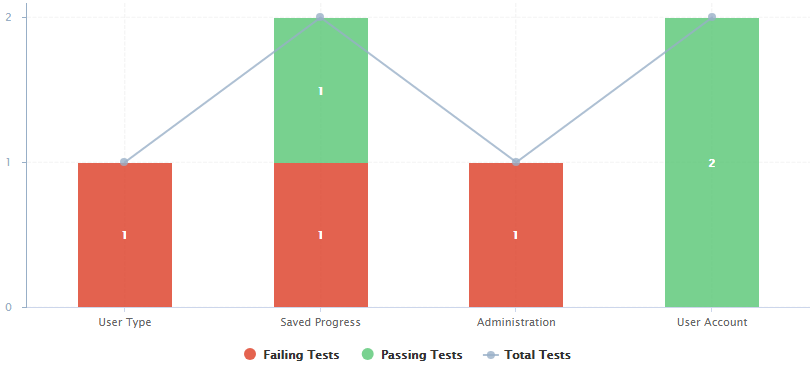
Artifact Series
This chart is supported in Model/Group Dashboards and Artifact Dashboards.
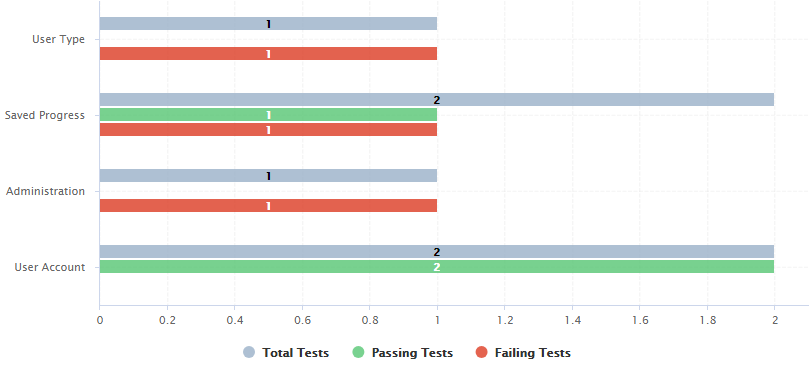
The Artifact Series chart displays one or more measures from descendant artifacts.
|
The measure representation uses either the renderer defined at chart level, or the specific renderer defined within a |
The chart also allows clicking on an artifact to display its dashboard.
<chart type="ARTEFACTSERIES" id="ARTEFACT_SERIES_EXAMPLE" inverted="true" orderByMeasure="NUM_FAILING_TESTS" renderer="BAR" orientation="HORIZONTAL">
	<paths>
		...
	<paths>
	<measure color="CYAN">NUM_TESTS_CODE</measure>
	<measure color="GREEN">NUM_PASSING_TESTS</measure>
	<measure color="RED">NUM_FAILING_TESTS</measure>
</chart>
The Artifact Series can also be used to draw a stacked bar chart for child artifacts and include a line via the use of several datasets, as shown below:
<chart type="ARTEFACTSERIES" id="ARTEFACT_SERIES_STACKED_BAR_EXAMPLE" inverted="true" orderByMeasure="NUM_FAILING_TESTS" orientation="VERTICAL">
	<paths>
		...
	<paths>
	<dataset renderer="STACKED_BAR">
		<measure color="RED" >NUM_FAILING_TESTS</measure>
		<measure color="GREEN" >NUM_PASSING_TESTS</measure>
	</dataset>
		<dataset renderer="LINE" rangeAxis="TOTAL">
		<measure color="CYAN">NUM_TESTS_CODE</measure>
	</dataset>
	<rangeAxis id="TOTAL" color="CYAN" min="0" location="left" type="number" numberFormat="INTEGER" />
</chart>
On top of supported common attributes, this chart also accepts the following additional attributes:
-
artefactsLimit(optional, default: 2000 ) allows limiting the number of child artifacts to include. -
orderByMeasure(optional, default: order of definition ) allows sorting the artifacts according to the value of the specified measure. -
inverted(optional, default: false) allows reversing the sort order defined by theorderByMeasureattribute. -
orientation(optional, default: VERTICAL) allows defining the orientation of the chart. The allowed values are VERTICAL and HORIZONTAL. -
decimals(optional, default: 0) is the number of decimals places to be used for displaying values. -
displayEmptyData(optional, default: false) forces the display of artifacts for which there is no corresponding data. -
renderer(optional, default: BAR) allows specifying the type of rendering for all measures in the chart. This can be omitted and overridden for individual datasets, as explained in Using Datasets and Renderers.
When used in this chart, the measure element accepts the following attributes:
-
label(optional, default: the measure’s name ) defines or overrides the label used for the measure. -
dataBounds(optional, default: "];[") defines the range of values allowed to be displayed on the chart. You can use this attribute to exclude drawing an erroneous or non-representative value on a chart.[and]allow you to specify that the boundary value is included, while]and[allow you to specify that the boundary value is excluded. -
stroke(optional, default: SOLID) defines the type of line used join points. The allowed values are NONE, SOLID and DOTTED. -
shape(optional, default: CIRCLE) defines the shape used to represent a point on a chart. The allowed values are:-
NONE
-
SQUARE
-
CIRCLE
-
DIAMOND
-
UP_TRIANGLE
-
DOWN_TRIANGLE
-
RIGHT_TRIANGLE
-
LEFT_TRIANGLE
-
HORIZONTAL_RECTANGLE
-
VERTICAL_RECTANGLE
-
HORIZONTAL_ELLIPSE
-
VERTICAL_ELLIPSE
-
-
visible(optional, default: true) allows including a measure on a chart as hidden. It will not be displayed by default, but can be added to the chart by clicking its name in the legend. -
color(optional, default: the project’s color, or a random color based on the artifact’s name ) defines the color used to represent the measure in the chart. To know more about colors, see the Working With Colors section. -
alpha(optional, default: 255) defines the alpha applied to the color defined withcolorattribute, 255 for no transparency, 0 for invisible color.
When used in this chart, the indicator element accepts the following attributes:
-
excludeLevels(optional, default: empty) to hide levels and exclude them from chart computations.
When used in this chart, the info element accepts the following attributes:
-
label(optional, default: the information value ) defines or overrides the label used for the information. -
excludeInfos(optional, default: empty) to hide information on the chart and exclude them from chart computations.
Artifact Table
This chart is supported in Model/Group Dashboards and Artifact Dashboards.
The Artifact Table chart allows displaying a list of child artifacts and one or more of their characteristics in table format, as shown below.
The Artifact Table chart takes one or more indicator, measure or info sub-elements. Note that the table cells are automatically colored according to the corresponding scale level color when the metric displayed in the table is an indicator.
This behaviour can be overridden by using the colorFromScale attribute, which takes a scale ID to apply color from according to the rank of the value displayed.
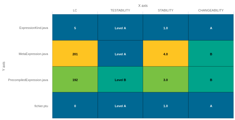
<chart type="ARTEFACTTABLE" id="ARTEFACT_TABLE_MEASURE" xLabel="X axis"yLabel="Y axis">
	<paths>
		...
	<paths>
	<indicator>LC</indicator>
	<indicator displayValueType="NAME">TESTABILITY</indicator>
	<indicator displayValueType="RANK">STABILITY</indicator>
	<indicator displayValueType="MNEMONIC">CHANGEABILITY</indicator>
</chart>|
In the example above, the indicators use different |
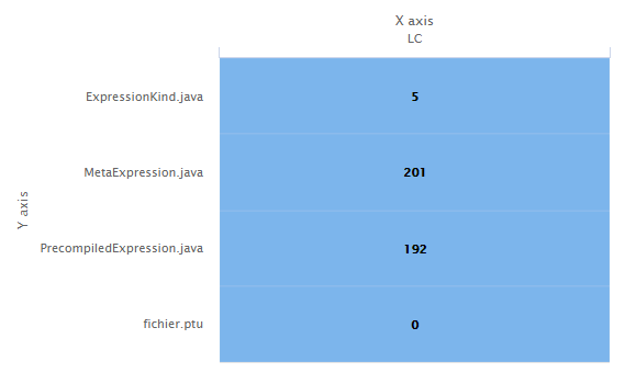
<chart id="ARTEFACT_TABLE_ID" type="ArtefactTable" xLabel="X axis" yLabel="Y axis">
	<paths>
		...
	<paths>
  <measure>LC</measure>
</chart>
On top of supported common attributes, this chart also accepts the following additional attributes:
-
artefactsLimit(optional, default: 2000 ) allows limiting the number of child artifacts to include. -
orderByMeasure(optional, default: alphabetical ) allows sorting the artifacts according to the value of the specified measure. -
inverted(optional, default: false) allows reversing the sort order defined by theorderByMeasureattribute. -
decimals(optional, default: 0) is the number of decimals places to be used for displaying values. -
displayEmptyData(optional, default: false) forces the display of artifacts for which there is no corresponding data.
When used in this chart, the measure element accepts the following attributes:
-
label(optional, default: the measure’s name ) defines or overrides the label used for the measure. -
dataBounds(optional, default: "];[") defines the range of values allowed to be displayed on the chart. You can use this attribute to exclude drawing an erroneous or non-representative value on a chart.[and]allow you to specify that the boundary value is included, while]and[allow you to specify that the boundary value is excluded.
When used in this chart, the indicator element accepts the following attributes:
-
label(optional, default: the indicator’s name ) defines or overrides the label used for the indicator. -
excludeLevels(optional, default: empty) to hide levels and exclude them from chart computations. -
displayValueType(optional, default: VALUE) defines how the metric value is shown in the interface. It may be one of:-
NAME the level’s name
-
MNEMONIC the level’s mnemonic
-
RANK the level’s rank
-
VALUE the measure’s value
-
PERCENT to automatically convert a value between 0 and 1 into a percentage (also appending '%' as a suffix)
-
ICON the level’s icon
-
DATE the measure value converted to date format
-
DATETIME the measure value converted to datetime format
-
TIME the measure value converted to time format
-
TEXT when the metric you are trying to display is textual information
-
When used in this chart, the info element accepts the following attributes:
-
label(optional, default: the information value ) defines or overrides the label used for the information. -
excludeInfos(optional, default: empty) to hide information on the chart and exclude them from chart computations.
When used in this chart, the findingScaleValue element accepts the following attributes:
-
excludeLevels(optional, default: empty) to hide levels and exclude them from chart computations. -
displayValueType(optional, default: VALUE) defines how the metric value is shown in the interface. It may be one of:-
NAME the level’s name
-
MNEMONIC the level’s mnemonic
-
RANK the level’s rank
-
VALUE the measure’s value
-
PERCENT to automatically convert a value between 0 and 1 into a percentage (also appending '%' as a suffix)
-
ICON the level’s icon
-
DATE the measure value converted to date format
-
DATETIME the measure value converted to datetime format
-
TIME the measure value converted to time format
-
TEXT when the metric you are trying to display is textual information
-
Artifact Time Series
This chart is supported only in Artifact Dashboards.
The Artifact Time Series chart displays one or more metrics from descendant artifacts on a timeline. It offers the same features as the Artifact Series chart and also provides options to aggregate by time period.
|
The measure representation uses either the renderer defined at chart level, or the specific renderer defined within a |
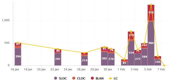
<chart type="ArtefactTimeSeries" id="ARTEFACTTIMESERIES_EXAMPLE" timeMeasure="DATE_FILE" timeInterval="DAY" timeIntervalAggregationType="SUM" byTime="true" renderer="STACKED_BAR">
	<paths>
		...
	<paths>
	<dataset renderer="STACKED_BAR">
		<measure>SLOC</measure>
		<measure>CLOC</measure>
		<measure>BLAN</measure>
	</dataset>

	<dataset renderer="LINE">
		<measure color="ORANGE">LC</measure>
	</dataset>
</chart>
In the example above, files are sorted by creation date on a daily timeline, with bars representing daily aggregates of several line count metrics for each file.
On top of supported common attributes and temporal attributes this chart also accepts the following additional attributes:
-
artefactsLimit(optional, default: 2000 ) allows limiting the number of child artifacts to include. -
orientation(optional, default: VERTICAL) allows defining the orientation of the chart. The allowed values are VERTICAL and HORIZONTAL. -
decimals(optional, default: 0) is the number of decimals places to be used for displaying values. -
renderer(optional, default: LINE) allows specifying the type of rendering for all measures in the chart. This can be omitted and overridden for individual datasets, as explained in Using Datasets and Renderers. -
isCChart(optional, default: false) transforms the chart in a C-Chart if set to true. This draws three extra lines to the chart at the following values on the y-axis: "mean", "mean + (coefficient * standard deviation)" and "mean - (coefficient * standard deviation)". -
coeff(optional, default: 0) sets the value of the coefficient used to draw the control lines either side of the mean line whenisCChartis set to true. -
breakOnMissingData(optional, default: false) specifies whether the line is interrupted (true) when a value is missing. -
displayDate(optional, default: false) for all charts that display information about several versions. When set to false, the version name is displayed in the chart. When set to true, the version date is displayed instead. -
onlyLast(optional, default: no limit) defines the number of versions to be displayed, starting from the one that is currently selected. -
byTime(optional, default: false) defines whether versions are placed on the x-axis according to their analysis dat. -
timeMeasure(optional) is the measure ID (of type DATE) to use as the analysis date for a chart wherebyTimeis true. If not specified, the real analysis date of the version is used. -
datePattern(formerlydateFormat) (optional, default: empty) : the date pattern, used when the displayType is one of DATE, DATETIME or TIME. For example:-
"yyyy.MM.dd G 'at' HH:mm:ss z" is "2001.07.04 AD at 12:08:56 PDT".
-
"EEE, d MMM yyyy HH:mm:ss Z" is "Wed, 4 Jul 2001 12:08:56 -0700".
If this attribute is set, both
dateStyleandtimeStyleattributes are ignored. The date is formatted using the supplied pattern. Any format compatible with the Java Simple Date Format can be used. Refer to http://docs.oracle.com/javase/8/docs/api/java/text/SimpleDateFormat.html for more information. -
-
dateStyle(optional, default: DEFAULT) : the date formatting style, used when thedisplayTypeis one of DATE or DATETIME.-
SHORT is completely numeric, such as 12.13.52 or 3:30pm.
-
MEDIUM is longer, such as Jan 12, 1952.
-
DEFAULT is MEDIUM.
-
LONG is longer, such as January 12, 1952 or 3:30:32pm.
-
FULL is pretty completely specified, such as Tuesday, April 12, 1952 AD or 3:30:42pm PST.
-
-
timeStyle(optional, default: DEFAULT): the time formatting style, used when the displayType is one of DATETIME or TIME. See above for available styles.
When used in this chart, the measure element accepts the following attributes:
-
label(optional, default: the measure’s name ) defines or overrides the label used for the measure. -
dataBounds(optional, default: "];[") defines the range of values allowed to be displayed on the chart. You can use this attribute to exclude drawing an erroneous or non-representative value on a chart.[and]allow you to specify that the boundary value is included, while]and[allow you to specify that the boundary value is excluded. -
stroke(optional, default: SOLID) defines the type of line used join points. The allowed values are NONE, SOLID and DOTTED. -
shape(optional, default: CIRCLE) defines the shape used to represent a point on a chart. The allowed values are:-
NONE
-
SQUARE
-
CIRCLE
-
DIAMOND
-
UP_TRIANGLE
-
DOWN_TRIANGLE
-
RIGHT_TRIANGLE
-
LEFT_TRIANGLE
-
HORIZONTAL_RECTANGLE
-
VERTICAL_RECTANGLE
-
HORIZONTAL_ELLIPSE
-
VERTICAL_ELLIPSE
-
-
visible(optional, default: true) allows including a measure on a chart as hidden. It will not be displayed by default, but can be added to the chart by clicking its name in the legend. -
color(optional, default: the project’s color, or a random color based on the artifact’s name ) defines the color used to represent the measure in the chart. To know more about colors, see the Working With Colors section. -
alpha(optional, default: 255) defines the alpha applied to the color defined withcolorattribute, 255 for no transparency, 0 for invisible color.
Cell Artifact Table
This chart is supported only in Artifact Dashboards.
The Cell Artifact Table offers a tabular representation of descendant artifacts of a certain type with added grouping and filtering possibilities compared to other table charts.
<chart	type="CellArtefactTable" id="CELLARTEFACTTABLE_EXAMPLE" colorFromIndicator="ROOT" orderByMeasure="RUN_DATE" enabledAxisLabels="true" insideAxisLabels="false" artefactNameAsColumn="true">
	<paths>
		...
	<paths>
	<groups>
		<group type="LINE" ancestorLevel="2" orderBy="NAME" />
	</groups>
</chart>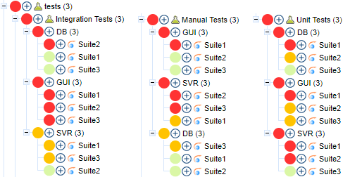
On top of supported common attributes this chart also accepts the following additional attributes:
-
backgroundColorForHeaderOnly(optional, default: false) allows displaying the background color in the header only. -
artefactsLimit(optional, default: 2000 ) allows limiting the number of child artifacts to include. -
orderByMeasure(optional, default: alphabetical ) allows sorting the artifacts according to the value of the specified measure. -
inverted(optional, default: false) allows reversing the sort order of bars in the chart. -
decimals(optional, default: 0) is the number of decimals places to be used for displaying values. -
enabledAxisLabels(optional, default: true) allows showing (true) or hiding (false) axis labels -
insideAxisLabels(optional, default: false) allows printing the axis labels to the right of the y-axis (true) instead of to the left (false) -
artefactNameAsColumn(optional, default: false) allows printing the artifact names inside the cells (false) or at the top of each column (true) -
colorFromIndicator(optional, default: none) uses the specified indicator’s color scale to assign a color to each item drawn on the chart.
Grouping can be achieved via a group element defining an ancestorLevel attribute:
<groups>
	<group type="COLUMNS" ancestorLevel="1" />
	<group type="LINE" ancestorLevel="2" orderBy="NAME" />
	<group type="LINES" ancestorLevel="1" orderBy="NAME" />
</groups>
Distribution Table
This chart is supported in Model/Group Dashboards and Artifact Dashboards.
The Distribution Table is a matrix-like visualisation of two characteristics of an artifact’s descendants.

<chart type="DISTRIBUTIONTABLE" id="DIST_TABLE_FIXED_COLOR_EXAMPLE" xLabel="Testability" yLabel="Number of Artifacts" topColor="ORANGE" bottomColor="BLUE">
	<paths>
		...
	<paths>
	<indicator>ROOT</indicator>
	<indicator>TESTABILITY</indicator>
	<row aggregationType="SUM" label="Total Col" color="GRAY" />
	<column aggregationType="SUM" label="Total Line" color="GRAY" />
</chart>
On top of supported common attributes this chart also accepts the following additional attributes:
-
backgroundColorForHeaderOnly(optional, default: false) allows displaying the background color in the header only. -
artefactsLimit(optional, default: 2000 ) allows limiting the number of child artifacts to include. -
decimals(optional, default: 0) is the number of decimals places to be used for displaying values. -
color(optional, default: WHITE) is the color used to fill all the cells in the table. An example Distribution Table usingcoloris shown later in this section (Working With Colors).Instead of using a single color for the entire table, you can use
topColor,middleColorandbottomColorto color the top, middle and bottom sections of the chart respectively in different colors, as in the main example above (Working With Colors). -
colorFromScale(optional, default: none) is the color scale used to fill the cells in the table according to the rank of each cell. An example Distribution Table usingcolorFromScaleis shown later in this section.Instead of using a single scale for the entire table, you can use
topcolorFromScale,middlecolorFromScaleandbottomcolorFromScaleto color the top, middle and bottom sections of the chart respectively using different color scales.
|
If several color attributes are found, they are applied in the following order: |
It also supports the common distributed charts grouping and aggregating features defined in Distributed Charts section.
In addition, you can add a row and column to aggregate the results found in each table row or column using the row or column element.
Each of these elements accepts the following attributes:
-
aggregationType(optional, default: SUM) defines how the values are aggregated. Supported values are:-
MIN: minimal value
-
MAX: maximal value
-
OCC: number of data points
-
AVG: average value
-
DEV: standard deviation
-
SUM: sum of values
-
MED: median value
-
MOD: modal value
-
-
label(mandatory) is a string that is displayed as the legend of the row or column. -
color(optional, default: GREY) is the fill color for the row or column (Working With Colors). -
colorFromScale(optional, default: empty) allows filling cells with a color taken from a specific scale.
Some simpler examples of Distribution Table charts can be found below:

<chart type="DISTRIBUTIONTABLE" id="DIST_TABLE_EXAMPLE" xLabel="Testability" yLabel="Number of Artifacts">
	<paths>
		...
	<paths>
	<indicator>ROOT</indicator>
	<indicator>ANALYSABILITY</indicator>
</chart>
Chart:
<chart type="DISTRIBUTIONTABLE" id="DIST_TABLE_SCALE_COLOR_EXAMPLE" xLabel="Testability" yLabel="Number of Artifacts" colorFromScale="SCALE_TEST_BASIC">
	<paths>
		...
	<paths>
	<indicator>ROOT</indicator>
	<indicator>TESTABILITY</indicator>
</chart>


Scale:
<Scale scaleId="SCALE_TEST_BASIC">
	<ScaleLevel levelId="LEVELA" bounds="];1]" rank="1" />
	<ScaleLevel levelId="LEVELB" bounds="]1;2]" rank="2" />
	<ScaleLevel levelId="LEVELC" bounds="]2;4]" rank="3" />
	<ScaleLevel levelId="LEVELD" bounds="]4;8]" rank="4" />
	<ScaleLevel levelId="LEVELE" bounds="]8;16]" rank="5" />
	<ScaleLevel levelId="LEVELF" bounds="]16;32]" rank="6" />
	<ScaleLevel levelId="LEVELG" bounds="]32;[" rank="7" />
</Scale>
Chart:
<chart type="DISTRIBUTIONTABLE" id="DIST_TABLE_SCALE_COLOR_TWO_COLORS_EXAMPLE" xLabel="Testability" yLabel="Number of Artifacts" topColorFromScale="SCALE_GREEN" middleColorFromScale="SCALE_RED" bottomColorFromScale="SCALE_RED">
	<paths>
		...
	<paths>
	<indicator>ROOT</indicator>
	<indicator>TESTABILITY</indicator>
</chart>


Scales:

<Scale scaleId="SCALE_GREEN">
	<ScaleLevel levelId="BLANK" bounds="];1[" rank="-1" />
	<ScaleLevel levelId="LEVELA" bounds="[1;[" rank="1" />
</Scale>

<Scale scaleId="SCALE_RED">
	<ScaleLevel levelId="BLANK" bounds="];1[" rank="-1" />
	<ScaleLevel levelId="LEVELG" bounds="[1;[" rank="1" />
</Scale>
Gantt
This chart is supported only in Artifact Dashboards.
The Gantt chart is usually used to illustrate a project schedule. It can be helpful to plan, coordinate and track specific tasks in said project.

<chart id="Gantt">
  <paths>
    ...
  <paths>
  <start>START</start>
  <end>END</end>
  <completed>COMPLETED</completed>
  <dependency linkType="CHILD_OF" linkDirection="OUT" />
  <groups groupByAncestors="true" />
  <milestones>
    <measure color="#da8989">M1</measure>
    <measure>M2</measure>
    <measure>M3</measure>
    <measure label="Milestone 20%">M4</measure>
    <measure label="Milestone 80%">M5</measure>
  </milestones>
  <markers>
    <marker isVertical="true" value="VERSION_DATE()+DAYS(1967)+IS_NEW_ARTEFACT()*79200000" color="#db5050" label="Date: {start}" labelAnchor="TOP_LEFT" labelFontSize="11" labelFontStyle="ITALIC" labelColor="#ff5656" />
  </markers>
</chart>
On top of supported common attributes this chart also accepts the following additional attributes:
-
backgroundColorForHeaderOnly(optional, default: false) allows displaying the background color in the header only. -
artefactsLimit(optional, default: 2000 ) allows limiting the number of child artifacts to include. -
orientation(optional, default: VERTICAL) allows defining the orientation of the chart. The allowed values are VERTICAL and HORIZONTAL. -
decimals(optional, default: 0) is the number of decimals places to be used for displaying values. -
colorFromIndicator(optional, default: none) uses the specified indicator’s color scale to assign a color to each item drawn on the chart.
The chart takes the following sub-elements :
-
startis the start date of the task. -
endis the end date of the task. -
completedis the level of completion of the task. -
dependencyallows to display the tasks dependencies between each others. Following attributes are required:-
linkTypeallows to filter artifacts linked to the current artifact according to their link type. For more information about links, refer to Artifact Links. -
linkDirection(optional, default: OUT) is used to specify the link direction to consider. Accepted values are:-
OUT to consider links from the current artifact towards other artifacts
-
IN to consider links from other artifacts towards the current artifact
-
-
-
groupsallows to group the tasks according to their ancestors. -
milestonesallows to display milestones icons in tasks. Following elements are supported :-
measureis used to specify the measure to consider for displaying the milestone. Following attributes are supported :-
labelis the label that will be displayed in the milestone’s tooltip when hoovering over its icon. -
coloris the color of the milestone’s icon. -
alphais the transparency level of the milestone’s icon.
-
-
|
Gantt chart does not support the LINKS value for the |
Histogram
This chart is supported in Model/Group Dashboards and Artifact Dashboards.
A typical Histogram that shows the repartition of a value for the children of the selected artifact It requires one measure element.

<chart type="HISTOGRAM" id="HISTOGRAM_EXAMPLE" nbBars="10">
	<paths>
		...
	<paths>
	<measure color="ORANGE">LC</measure>
</chart>
On top of supported common attributes this chart also accepts the following additional attributes:
-
backgroundColorForHeaderOnly(optional, default: false) allows displaying the background color in the header only. -
artefactsLimit(optional, default: 2000 ) allows limiting the number of child artifacts to include. -
orientation(optional, default: VERTICAL) allows defining the orientation of the chart. The allowed values are VERTICAL and HORIZONTAL. -
decimals(optional, default: 0) is the number of decimals places to be used for displaying values. -
nbBarssets the number of bars desired in the chart.
When used in this chart, the measure element accepts the following attributes:
-
dataBounds(optional, default: "];[") defines the range of values allowed to be displayed on the chart. You can use this attribute to exclude drawing an erroneous or non-representative value on a chart.[and]allow you to specify that the boundary value is included, while]and[allow you to specify that the boundary value is excluded. -
shape(optional, default: CIRCLE) defines the shape used to represent a point on a chart. The allowed values are:-
NONE
-
SQUARE
-
CIRCLE
-
DIAMOND
-
UP_TRIANGLE
-
DOWN_TRIANGLE
-
RIGHT_TRIANGLE
-
LEFT_TRIANGLE
-
HORIZONTAL_RECTANGLE
-
VERTICAL_RECTANGLE
-
HORIZONTAL_ELLIPSE
-
VERTICAL_ELLIPSE
-
-
color(optional, default: the project’s color, or a random color based on the artifact’s name ) defines the color used to represent the measure in the chart. To know more about colors, see the Working With Colors section. -
alpha(optional, default: 255) defines the alpha applied to the color defined withcolorattribute, 255 for no transparency, 0 for invisible color.
Network
This chart is supported only in Artifact Dashboards.
The Network chart allows to display data using a series of nodes and links. It is useful to visualize the interconnections and relationships between the elements of a given set of data.

<chart type="Network" id="NETWORK_LINKS" animation="true" fixedRootNode="true">
	<paths>
		<path scope="DESCENDANTS" targetArtefactTypes="REQ_FOLDER">
			<path scope="CHILDREN" targetArtefactTypes="REQ">
				<path scope="LINKS" linkTypes="SATISFIED_BY;IMPLEMENTED_BY;TESTED;TESTED_BY" />
			</path>
		</path>
	</paths>
	<measure>TEST_DURATION</measure>
</chart>
On top of supported common attributes this chart also accepts the following additional attributes:
-
backgroundColorForHeaderOnly(optional, default: false) allows displaying the background color in the header only. -
artefactsLimit(optional, default: 2000 ) allows limiting the number of child artifacts to include. -
decimals(optional, default: 0) is the number of decimals places to be used for displaying values. -
maxDisplayableLabels(optional, default: 30) to specify the maximum number of nodes for which the label will be displayed. -
fixedRootNode(optional, default: true) to center the current artifact node in the drawing area. -
animation(optional, default: true) to enable animation while chart is loading. -
colorFromIndicator(optional, default: none) uses the specified indicator’s color scale to assign a color to each item drawn on the chart.
The chart element accepts the following sub-elements:
-
measure(optional) to specify the measure to use for computing the nodes size. Only a measure valid for all the types of every artifact set elements returned by the last level can be used. When used the following attributes are accepted:-
label(optional, default: the measure’s name ) defines or overrides the label used for the measure. -
dataBounds(optional, default: "];[") defines the range of values allowed to be displayed on the chart. You can use this attribute to exclude drawing an erroneous or non-representative value on a chart.[and]allow you to specify that the boundary value is included, while]and[allow you to specify that the boundary value is excluded.
-
In addition to the common attributes of the path element, this charts also accepts the following:
-
displayAncestorNodes(optional, default: true) to display the ancestors of the artifact returned by the artifacts set (even though they do not match the conditions of the artifacts set). -
hideLeaves(optional, default: false) to hide the nodes without any relationships with any of the elements returned by the artifacts set of the level below (dead-end nodes).
Pivot Table
This chart is supported in Model/Group Dashboards and Artifact Dashboards.
The Pivot Table displays, combines and summarises information from several metrics, grouping them by indicator level. It also displays a column per included metric and additional columns showing the min, max, count or data aggregates for each line.

<chart id="PIVOT_TABLE_EXAMPLE" type="PIVOTTABLE">
	<paths>
		...
	<paths>
  <indicator>ANALYSABILITY</indicator>
  <indicator>LC</indicator>
</chart>
<chart id="PIVOT_TABLE_ADVANCED" type="PivotTable" inverted="true">
	<paths>
		...
	<paths>
  <indicator excludeLevels="TICKET_CLOSED">STATUS</indicator>
  <columns>
    <column measureId="AGE" aggregationType="MIN" label="newest (MIN of Age)" />
    <column measureId="AGE" aggregationType="MAX" label="oldest (MAX of Age)" />
  </columns>
</chart>
On top of supported common attributes this chart also accepts the following additional attributes:
-
backgroundColorForHeaderOnly(optional, default: false) allows displaying the background color in the header only. -
artefactsLimit(optional, default: 2000 ) allows limiting the number of child artifacts to include. -
inverted(optional, default: false) allows reversing the sort order of lines in the chart. -
decimals(optional, default: 0) is the number of decimals places to be used for displaying values. -
displayEmptyData(optional, default: false) forces the display of artifacts for which there is no corresponding data. -
orderByCount(optional, default: false) allows ordering the table according to the count column when set to true instead of using the scale of the first column of the chart.
It also supports the common distributed charts grouping and aggregating features defined in Distributed Charts section.
Quadrant
This chart is supported in Model/Group Dashboards and Artifact Dashboards.
The Quadrant chart displays information about the descendants of the current artifact. Three measures are required to construct the chart: one for the X-axis, one for the Y-axis one for the size of the bubbles. The chart also allows to set markers to define colored areas.

<chart type="QUADRANT" id="QUADRANT_EXAMPLE">
	<paths>
		...
	<paths>
	<xmeasure>CLOC</xmeasure>
	<ymeasure>SLOC</ymeasure>
	<zmeasure>LC</zmeasure>
	<markers>
		<marker value="15" color="BLACK" alpha="50" isVertical="true" />
		<marker value="200" color="BLACK" alpha="50" isVertical="false" />
	</markers>
</chart>
On top of supported common attributes this chart also accepts the following additional attributes:
-
backgroundColorForHeaderOnly(optional, default: false) allows displaying the background color in the header only. -
artefactsLimit(optional, default: 2000 ) allows limiting the number of child artifacts to include. -
orientation(optional, default: VERTICAL) allows defining the orientation of the chart. The allowed values are VERTICAL and HORIZONTAL. -
decimals(optional, default: 0) is the number of decimals places to be used for displaying values. -
colorFromIndicator(optional, default: none) uses the specified indicator’s color scale to assign a color to each item drawn on the chart.
The chart element requires the following sub-elements:
-
xmeasureis the measure used on the x-axis. -
ymeasureis the measure used on the y-axis. -
zmeasureis the measure used to compute the bubbles size.
Simple Bar
This chart is supported in Model/Group Dashboards and Artifact Dashboards.
The Simple Bar chart presents the aggregation of the different ratings found in all the children of the selected artifact as a histogram.

<chart type="SIMPLEBAR" id="SIMPLE_BAR_EXAMPLE">
	<paths>
		...
	<paths>
	<indicator>LEVEL</indicator>
</chart>
On top of supported common attributes this chart also accepts the following additional attributes:
-
backgroundColorForHeaderOnly(optional, default: false) allows displaying the background color in the header only. -
artefactsLimit(optional, default: 2000 ) allows limiting the number of child artifacts to include. -
orientation(optional, default: VERTICAL) allows defining the orientation of the chart. The allowed values are VERTICAL and HORIZONTAL. -
decimals(optional, default: 0) is the number of decimals places to be used for displaying values. -
displayEmptyData(optional, default: false) forces the display of artifacts for which there is no corresponding data. -
asPercentage(optional, default: false) specifies whether the values are displayed as real values or percentages.
It also supports the common distributed charts grouping and aggregating features defined in Distributed Charts section.
Simple Pie
This chart is supported in Model/Group Dashboards and Artifact Dashboards.
The Simple Pie chart presents the aggregation of the different ratings found in all the children of the selected artifact.

<chart type="SIMPLEPIE" id="SIMPLE_PIE_EXAMPLE">
	<paths>
		...
	<paths>
	<indicator>ROOT</indicator>
</chart>
The chart also allows you to use multiple indicators or informations to build a doughnut chart, or a clickable chart to let users click pie sections to drill down data.
|
A maximum of 4 indicators is supported |

<chart type="SIMPLEPIE" id="SIMPLE_PIE_DOUGHNUT">
	<paths>
		...
	<paths>
	<indicator>STATUS</indicator>
	<indicator>DETAILED_STATUS</indicator>
</chart>
<chart type="SIMPLEPIE" id="SIMPLE_PIE_DRILLDOWN" drilldown="true">
	<paths>
		...
	<paths>
	<indicator>STATUS</indicator>
	<indicator>DETAILED_STATUS</indicator>
</chart>
On top of supported common attributes this chart also accepts the following additional attributes:
-
backgroundColorForHeaderOnly(optional, default: false) allows displaying the background color in the header only. -
artefactsLimit(optional, default: 2000 ) allows limiting the number of child artifacts to include. -
decimals(optional, default: 0) is the number of decimals places to be used for displaying values. -
displayEmptyData(optional, default: false) forces the display of artifacts for which there is no corresponding data. -
labels(optional, default: true) displays the labels. -
valueOnLabels(optional, default: false) displays the value alongside the labels. -
drilldown(optional, default: false) allows you to configure the Simple Pie as interactive chart where users can click pie slices to drill down deeper into the data.
It also supports the common distributed charts grouping and aggregating features defined in Distributed Charts section.
|
This chart is equivalent to using an Optimised Pie chart with the definition shown below. The pie chart is optimised because the measures it uses already have been computed during the analysis and do not need to be calculated on the fly. |
Stacked Bar
This chart is supported in Model/Group Dashboards and Artifact Dashboards.
The Stacked Bar crosses the performance levels of two indicators, measures or textual infos for the children of the selected artifact along two axes.

<chart type="STACKEDBAR" id="STACKED_BAR_EXAMPLE">
	<paths>
		...
	<paths>
	<indicator>ROOT</indicator>
	<indicator>TESTABILITY</indicator>
</chart>
On top of supported common attributes this chart also accepts the following additional attributes:
-
backgroundColorForHeaderOnly(optional, default: false) allows displaying the background color in the header only. -
artefactsLimit(optional, default: 2000 ) allows limiting the number of child artifacts to include. -
orientation(optional, default: VERTICAL) allows defining the orientation of the chart. The allowed values are VERTICAL and HORIZONTAL. -
decimals(optional, default: 0) is the number of decimals places to be used for displaying values. -
displayEmptyData(optional, default: false) forces the display of artifacts for which there is no corresponding data. -
asPercentage(optional, default: false) specifies whether the values are displayed as real values or percentages. -
renderer(optional, default: BAR) allows specifying the type of rendering for the data series.
It also supports the common distributed charts grouping and aggregating features defined in Distributed Charts section.
Treemap
This chart is supported in Model/Group Dashboards and Artifact Dashboards.
The Treemap offers a graphical representation of child artifacts as a set of tiled rectangles.
It requires one measure to define the size of the tiles and accepts a colorFromIndicator attribute to pick the colors of the tiles.
Tiles are generated from largest to smallest, and from top left to bottom right.
Clicking a tile takes you to the dashboard of the corresponding artifact.

<chart type="TREEMAP" id="TREEMAP_EXAMPLE" colorFromIndicator="ROOT">
	<paths>
		...
	<paths>
	<measure>LC</measure>
</chart>
On top of supported common attributes this chart also accepts the following additional attributes:
-
backgroundColorForHeaderOnly(optional, default: false) allows displaying the background color in the header only. -
artefactsLimit(optional, default: 2000 ) allows limiting the number of child artifacts to include. -
decimals(optional, default: 0) is the number of decimals places to be used for displaying values. -
colorFromIndicator(optional, default: none) uses the specified indicator’s color scale to assign a color to each item drawn on the chart. -
maxDisplayableLabels(optional, default: 250) allows you to limit the number of tiles that get a label on a treemap. This is only useful if you have large treemap charts that cause performance issues.
When used in this chart, the measure element accepts the following attributes:
-
label(optional, default: the measure’s name ) defines or overrides the label used for the measure. -
dataBounds(optional, default: "];[") defines the range of values allowed to be displayed on the chart. You can use this attribute to exclude drawing an erroneous or non-representative value on a chart.[and]allow you to specify that the boundary value is included, while]and[allow you to specify that the boundary value is excluded.
|
This chart can be used in Model/Group Dashboards.
In this case, the only value allowed for |
X/Y-Cloud
This chart is supported in Model/Group Dashboards and Artifact Dashboards.
The X/Y-Cloud chart is a visual representation of the values of two measures or indicators for the children of the selected artifact. For each child of the requested type, a dot is drawn with the value found for the selected measure.

<chart type="CORRELATEDCLOUD" id="CORRELATED_CLOUD_EXAMPLE" coeff="1" colorFromIndicator="LEVEL">
	<paths>
		...
	<paths>
	<xmeasure>TESTABILITY</xmeasure>
	<ymeasure>STABILITY</ymeasure>
</chart>
On top of supported common attributes this chart also accepts the following additional attributes:
-
showPolynomialRegression(optional, default: true) whether the polynomial regression is drawn (true) or not drawn (false) on the chart. -
coeff(optional, default: 1) the degree of the drawn polynomial. Supported values are:-
1 for linear
-
2 for quadratic
-
3 for cubic
-
-
backgroundColorForHeaderOnly(optional, default: false) allows displaying the background color in the header only. -
artefactsLimit(optional, default: 2000 ) allows limiting the number of child artifacts to include. -
orientation(optional, default: VERTICAL) allows defining the orientation of the chart. The allowed values are VERTICAL and HORIZONTAL. -
decimals(optional, default: 0) is the number of decimals places to be used for displaying values. -
shape(optional, default: SQUARE) defines the shape of the points on the chart. The supported values are:-
SQUARE
-
CIRCLE
-
DIAMOND
-
UP_TRIANGLE
-
DOWN_TRIANGLE
-
RIGHT_TRIANGLE
-
LEFT_TRIANGLE
-
HORIZONTAL_RECTANGLE
-
VERTICAL_RECTANGLE
-
HORIZONTAL_ELLIPSE
-
VERTICAL_ELLIPSE
-
-
shapeWidth(optional, default: 4.0) defines the width of the point on the maximised chart. -
miniShapeWidth(optional, default: 2.0) defines the width of the point on the chart thumbnail. -
colorFromIndicator(optional, default: none) uses the specified indicator’s color scale to assign a color to each item drawn on the chart.
The chart takes two sub-elements, one xmeasure and one ymeasure, with the following attributes:
-
dataBounds(optional, default: "];[") defines the range of values allowed to be displayed on the chart. You can use this attribute to exclude drawing an erroneous or non-representative value on a chart.[and]allow you to specify that the boundary value is included, while]and[allow you to specify that the boundary value is excluded. -
label(optional, default: the measure’s name ) defines or overrides the label used for the measure.
Y-Cloud
This chart is supported in Model/Group Dashboards and Artifact Dashboards.
The Y-Cloud chart is a visual representation of the values of a measure or indicator for the children of the selected artifact.
For each child of the requested type, a dot is drawn with the value found for the selected measure.
The chart requires one indicator element.

<chart type="YCloud" id="YCLOUD_EXAMPLE">
	<paths>
		...
	<paths>
	<indicator color="RED">LC</indicator>
</chart>
On top of supported common attributes this chart also accepts the following additional attributes:
-
backgroundColorForHeaderOnly(optional, default: false) allows displaying the background color in the header only. -
artefactsLimit(optional, default: 2000 ) allows limiting the number of child artifacts to include. -
orientation(optional, default: VERTICAL) allows defining the orientation of the chart. The allowed values are VERTICAL and HORIZONTAL. -
decimals(optional, default: 0) is the number of decimals places to be used for displaying values.
When used in this chart, the measure element accepts the following attributes:
-
dataBounds(optional, default: "];[") defines the range of values allowed to be displayed on the chart. You can use this attribute to exclude drawing an erroneous or non-representative value on a chart.[and]allow you to specify that the boundary value is included, while]and[allow you to specify that the boundary value is excluded.